I've Got You Covered...
 The difference between the four book covers is the tone that each of them project. The first cover coveys a confused and energetic tone with a blurry figure moving around; the second showcases a somber and isolated tone with an empty boat beached on a calm and empty shore; the third one conveys an inquisitive tone with a girl shown to be in deep thought; the fourth cover showcases an intimidating and terrifying tone with the black and dark grey color scheme.
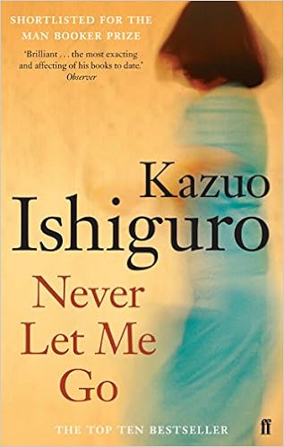
 The first cover looks like it would be a historical fiction novel with he rustic aesthetic; the second looks like it would be a memoir with the somber landscape promoting an isolated tale; the third shows a coming-of-age tale with an intrigued teen pictured; the fourth shows a dystopian story with the barbed wire and dark colors shown.
The first is used to showcase the theme of we vs. them with the blurred out "we;" the second shows what I'm assuming is their trip to Norfolk, which was a pinnacle plot point; the third shows the main character (which honestly I think is bland lol); the fourth shows the message that these people are only used for their organs and are confined.
 When I saw the first cover I immediately thought of a joyful story with the warm colors and the bright turquoise. I would think this story was about a young girl growing up around her family. After reading the book, I learned that this was actually used to convey how the donors were not actually seen as people, but rather as "blurred" versions of home they were cloned from. This would attract teenagers who are interested in realistic fiction, and they would love the coming-of-age aspects of the story, and the friendship between Kathy, Ruth and Tommy.
 When I saw the fourth cover, I thought it would be scientific based with its steel cover and barbed wire being pictured. After reading, I learn that I am mostly correct. However, this is more ambiguous in the beginning, and it is only later discovered later in the novel that the donors are having their organs harvested for their clones, which gives the novel a more science fiction direction. This text would attract science fiction fans, as they would most likely gage the same initial reaction that I did, and they would be attracted to the "robotic" plot themes in the novel.


Your post was super interesting! I enjoyed reading your perspective of the different book covers and how you visualized them in relation to the book. I liked how you gave your perspective before and after reading the book and how it may have changed once you knew more information. Overall I think you did a great job :)
ReplyDeleteHey, Olivia. This is a great post! What I found to be really interesting was your further examination, specifically, what type of audience the respective covers would attract. I agree with your assessment that #3 would attract teenagers who enjoy realistic fiction while #4 would attract sci-fi fans. It's interesting considering those genres are so different! Perhaps that could be a good technique for drawing in a wide range of audiences?
ReplyDeleteHey girl heyyyy, sick blog post I really enjoyed it and can I say A+++ for the way that you structured it . But anyways now to what Mrs. G really cares about... your perspectives were awesome espeically with the way you analyzed the 1st and 4th covers. I mentioned the barbed wire and how that could giving some insight as to what the book was about. Then, after reading and finally gaining some contex I too figured out that my analysis could be correct because of how they have donate their vital organs even if they don't want to. Overall this was such a good blog post, maybe in your future ones you could try expanding on any themes that you bring up and refer them back to your overall blog post.
ReplyDeleteI loved how you analyzed more than just what figures appear in the image, but also considered color scheme in your analysis. The darkness within the background of cover #2 can create a strong argument in stating that it creates a negative tone for the book. Personally, when I compared and contrasted the covers, I noticed a reoccurring use of the color of yellow, which I feel you could consider in the future. Overall the individual connections to the text (specifically in #3 with the connection to Kathy) is extremely strong, making it an enjoyable read.
ReplyDeleteFirst off, I love the structure you have and where you put the pictures! What you predict the book will be about was a good element to include rather than just how it made you feel. You also touched on how it makes others feel such as the last cover by saying it would attract readers of science fiction which was excellent. Good job boooo :)
ReplyDelete